Citysocializer
The redesign of a rapidly expanding social-networking app, which allows it's members to meet new people and explore new cities.
Timeframe - Jun 2014 - Nov 2014 Role - Junior UI Designer
Timeframe - Jun 2014 - Nov 2014
Role - Junior UI Designer

Overview
Overview
Citysocializer was already an established app and brand when I joined the team; however, the app was fragmented and lacked refinement and users were declining fast. I joined Citysocializer to redesign the iOS app, improving the user experience, design language and reigniting the excitement for this social app.
My Role
User interviews, ideation, user flows, wireframing, prototyping, user testing, UI component library.
The Team
Stefan Manastirliu, Filippo Chiumiento, Bethany Wright, Victoria McDowell, Andrea Gonteri, Pawel Kaminski
The Challenge
My first challenge at Citysocializer was to understand where the problems were and decide how I could solve them. It didn’t take long to identify huge problems with the experience in the app, and also the outdated and unpolished visual language throughout.
I often spoke with active members of Citysocializer at the social events which they hosted, so I could get a much better understanding of what they wanted from the app. They often mentioned the app didn’t look or feel very professional, and users found it difficult doing simple tasks within the app.
User Flows
I mapped out the entire app to see where potential problems occurred and how I might solve them. It also helped to identify the scale of components that I would need to build for the new design system I would be creating.
Design Language
Once the low fidelity prototypes got approved, I then developed a tangible and sophisticated design system. Because of the release of iOS 7, introducing flat design and the removal of skeuomorphism, I wanted to create a language that would adapt to Apple's ecosystem.
Citysocializer already used yellow within the branding, and so I took that further and include this within the UI components as the colour exhibits psychologic qualities and is perceived as warm, friendly and positive. I then complimented this with a rich navy blue as it's a tertiary colour to the yellow but also shows qualities of trust, strength and communication.
I then experimented with various typefaces and decided I wanted a primary and secondary typeface which could be for details, headers and titles. I chose Brandon Grotesque for the primary as it's clean, sharp, minimal and legible for devices. I complimented this with Rooney which is a serif typeface with similar x-height to Brandon grotesque which looks visually appealing.
The current app was using iconography throughout; however, there was no conformity in style, and some icons were outlines whilst others were solid or glyph form. I designed an icon set for the app in a consistent form using a 24px base grid, and 2px corner radius, which gave the icons a sociable and helpful demeanour.

UI Component Library
Having mapped out the entire app and user flows, I could build out a flexible and consistent UI component library in Sketch. This made it very efficient for other designers on the team to build screens but also made the workflow from design to development for efficient.
Having mapped out the entire app and user flows, I could build out a flexible and consistent UI component library in Sketch. This made it very efficient for other designers on the team to build screens but also made the workflow from design to development for efficient.

Final Designs
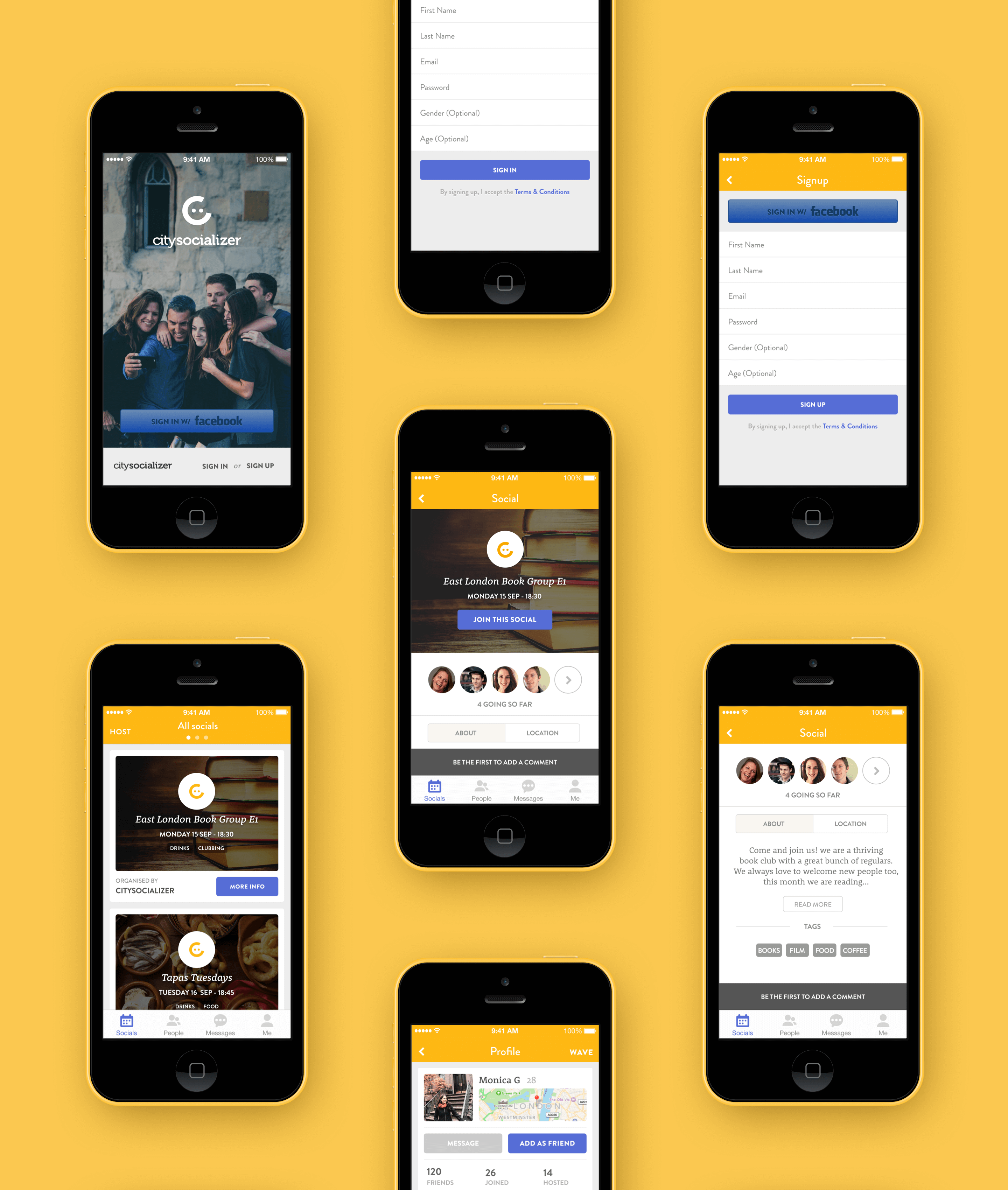
Several months, many iterations and lots of user testing with citysocializer members, we finally released the updated app. I redesigned Citysocializer from the ground up, including a change in user experience which made it easier to achieve the desired actions. The UI is clean, modern, refreshing and on brand and reflects a fun, young and innovative company.


PREVIOUS PROJECT
NEXT PROJECT
❖ Anthony Eamens 2022©
Anthony Eamens 2020©


