Sainsbury's
Smartshop is the first in-store shopping app for iOS and Android released by the brand new digital experience team, helping customers to shop, pay and skip the queues.
Smartshop is the first in-store shopping app for iOS and Android released by the brand new digital experience team, helping customers to shop, pay and skip the queues.
Timeframe - Apr 2015 - Apr 2016 Role - Midweight UI Designer
Timeframe - Apr 2015 - Apr 2016
Role - Midweight UI Designer
Overview
Sainsbury’s is one of the largest supermarkets in the UK, with a history spanning 150 years, 1400 stores and 165,000 members of staff. Not to mention it has built an impressive portfolio of additional businesses such as Argos, Tu Clothing, Habitat, Sainsbury’s Bank and Sainsbury’s Home.
In 2015 Sainsbury’s realised they were late to the game in the digital sector and made a significant investment and opened their first Digital Experience Department. As one of the first UI designers hired within the new Digital experience team, they tasked me to work on a brand new mobile shopping experience called SmartShop.
The Team
Andy Hajitheodoulou, Stephen Ellsworth, Tom Springall, Annalisa Cividati, Nick Pelling, Dan Marley, Ben Brewer, Jaskharan Sandhu
The Design Process
As a new digital department, we wanted to explore new ways of working. We were all familiar with Waterfall and Agile; however, we wanted to explore new practices which could be more efficient.
Therefore, we approached the Design council and worked closely with their team to adopt their custom work method the Double Diamond.
“Design Council’s Double Diamond clearly conveys a design process to designers and non-designers alike. The two diamonds represent a process of exploring an issue more widely or deeply (divergent thinking) and then taking focused action (convergent thinking).” - Design council

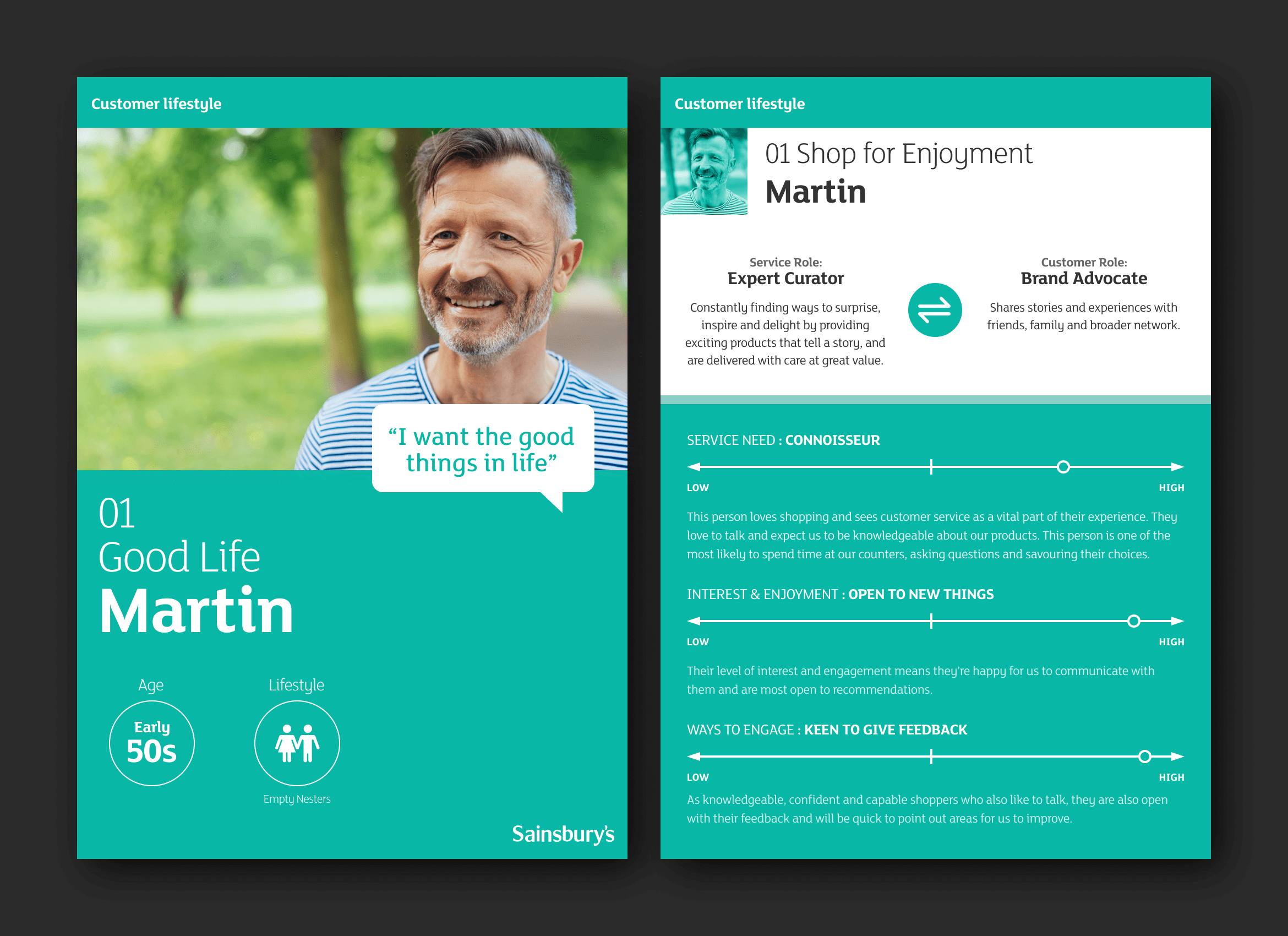
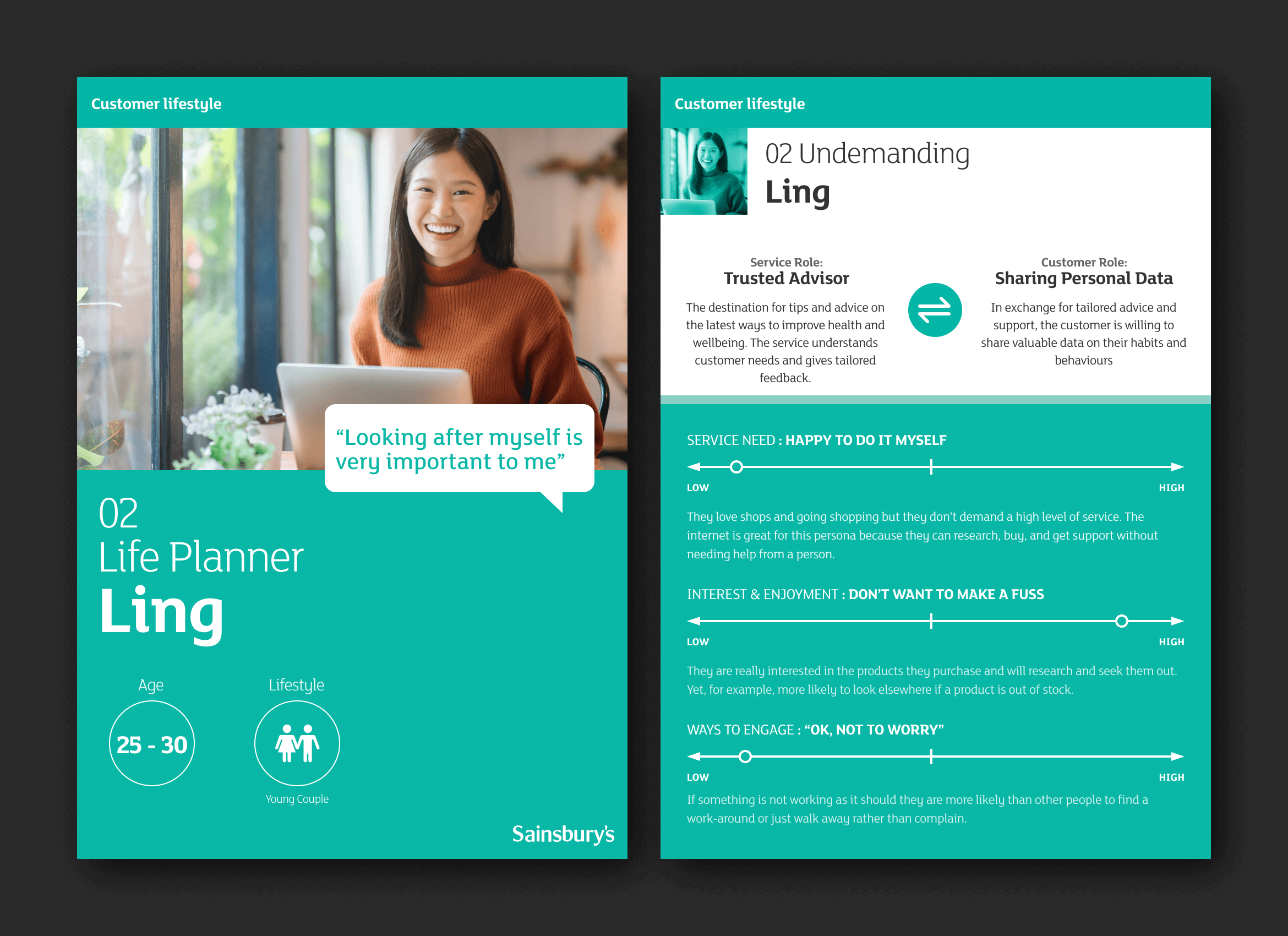
Persona's
To get a better understanding of our customers and how they use our products and services, we conducted many customer interviews. Working closely with user experience and user research designers, we collated our data and created a set of in-depth personas which we could use across the whole digital team. These were first used whilst designing and building Smartshop so we could iterate and build a better experience for our customers.


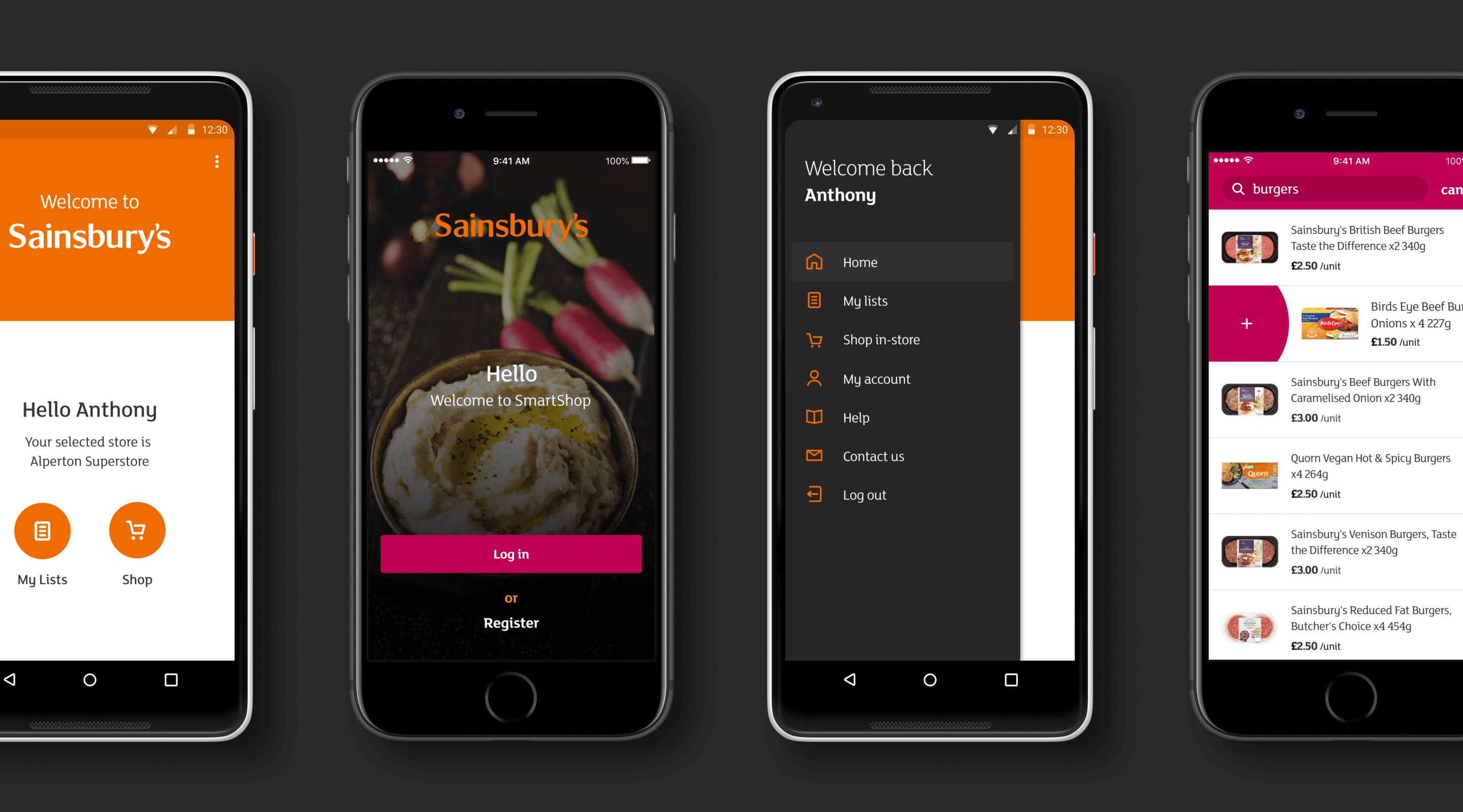
SmartShop Userflows
Together with user experience and research analysis’s, we had gathered enough data and insights to begin our ideation stage of the project. This is where we sketched potential solutions to flows and features we wanted to include in Smartshop.
It was vital for us to ensure Smartshop was an intuitive and effortless experience, as it would distract the customer when physically searching and picking their items in-store and so the UI and experience needed not to be obstructive or perplexing.

Digital Design Language
Although Sainsbury's is an established brand throughout the UK, it lacked digital guidelines, and their current system only supported print. As a result, working amongst a small team of designers and creative director, we transformed the existing guidelines into a new digital format, including grid systems, colour palette, typefaces and iconography.
Following the completion of digital guidelines, I then started work on a flexible mobile grid system which we used for multiple platforms including iOS, Android and Windows Phones. I completed the grid system along with a baseline grid and focused my efforts on defining iconography for the app as Sainsbury's current iconography was fragmented and inconsistent.
Sainsbury's uses a custom typeface called Mary Ann (John Sainsbury's Wife) throughout the entirety of the brand. After testing this typeface and its legibility, it was decided that it would work for mobile devices too.
The colour palette was already defined in the guidelines. Still, after transforming this to digital, we actually increased the saturation slightly of all the colours, as we wanted all digital products to appear fresh, confident and fearless.

UI Component Library
Once the team had successfully defined the design foundations for Luna, we then applied these decisions to our respective channels. As I was working on the first mobile app to come out of the digital experience team, it was my responsibility to define components for these platforms.
I also implemented a new design workflow/process within the team as we were currently using Adobe Photoshop and slicing assets. I introduced the team to Sketch and showcased its features and capabilities, in particular, the simplicity of design to development handover. This was immediately adopted in the digital experience team.

Final Designs
Smartshop got released in October 2015 trial in a select number of Sainsbury's stores. The first digital product to get released from the newly formed digital experience team. The app was intentionally designed to be a bold statement; it was innovative, efficient and smart.

PREVIOUS PROJECT
NEXT PROJECT
Anthony Eamens 2025©
Anthony Eamens 2020©